This page is for participants preparing for my class:
The “Big Project” of Calligraphy.

Make a large panel of calligraphy composed of blocks of text set in dynamic contrast.
A 4-5 day workshop with Denis Brown
Intermediate to Advanced level

Participants are requested to prepare preliminary designs at home in advance, so that time in the workshop can be utilized to maximum effect. Please research and source text on any chosen theme, and prepare an initial layout of your large scale traditional panel. It may be a rough "paste-up" as shown below, with all writing at actual size. The following information may be useful, but if you do not understand all, that is OK. Do the best you can for now and your questions will be answered in class.


What size should the work be? What kind of paper?

How many words should it have?

How should I prepare my design?

How many scripts should I use?

Should I use illustration or decoration?

Gallery   Some examples as an introduction

The class description and material list


What size should the work be? What kind of paper?
Think about using the full size of a large sheet of quality paper. Different papers come is different sizes, but for example, BFK Rives is one option which comes in 56 x 76cm, but is also available in even larger sheets (66 x 101) for those who want to have more room. Remember to leave adequate space for margins and be aware that in class my critiques might direct you towards a more spacious layout if things look cramped (as is often the case in preliminary designs). If your paper is not big enough, this will mean reducing the size of all writing. Some papers including BFK Rives also can be ordered in rolls to practically free you of size limitations.
Other papers to consider include Saunders Waterford, Arches Aquarelle or other quality watercolour papers. Generally you will want the HP (hot press, smoother) version and a natural white rather than a bright white. Toned or coloured papers such as Canson Mi-Tientes are also an option. These papers can be sourced and ordered online if you do not have access to a good local art store. Bring at least 4 sheets of whatever nice paper you choose to work on, plus plenty of cheaper practice paper.


How many words should it have?
Bring text or texts with 1000 words or more, so you have enough text for several contrasting text block(You may decide to use less in your project, but it’s good to have more text to hand than you plan to use. The text may be from one source, or be a compilation of complementary texts from different sources. It could include an extract of literature or poetry plus a commentary or review for example. Choosing suitable and stimulating text is your first creative task.


How should I prepare my design?
Begin with “thumbnail sketches”, as illustrated lower down the page, to rough out a design featuring several text blocks with contrasting sizes of writing. Perhaps there will be a headline or title? Maybe a small line at the bottom accrediting the author(s) and source?
Next draft out your text blocks writing at actual size on separate pieces of layout paper that can then be arranged against each other and glued down to make a “paste up”. The writing does not need to be perfect, you may be able to write faster at this early stage yet still give a good indication of the weight and texture. The weight of each text block should also be considered. Weight has to do with how many nib-widths you choose to make your guidelines, but also has to do with how compressed or narrow the script is. More compression gives bolder weight. Line spacing also affects the weight of text blocks. Consider a hierarchy of importance in your design. More important text blocks may be larger in writing size but also heavier in weight. A line of accreditation of the authors name might be in light weight, widely spaced capitals.

How many scripts should I use?
You do not need to incorporate every script you know! It may be more effective to limit your scripts to one or two styles and work more with weight and scale contrasts. Some text written in all capitals of one of your chosen styles is worth considering.

Should I use illustration or decoration?
This is not really necessary but could be an addition element in your design if you have a drawing or painting technique you would like to use in addition to calligraphy.


Gallery
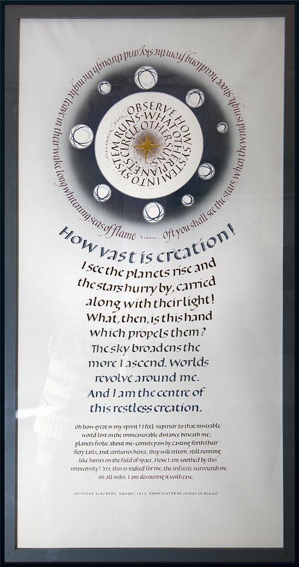
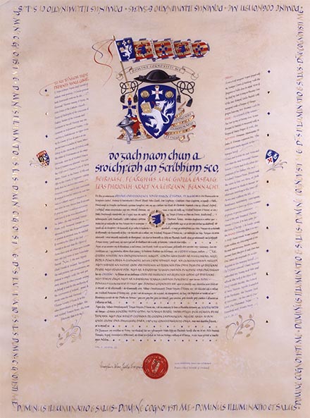
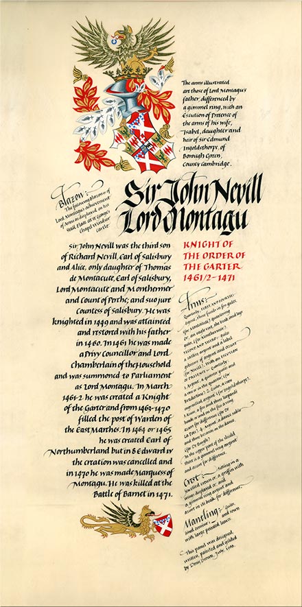
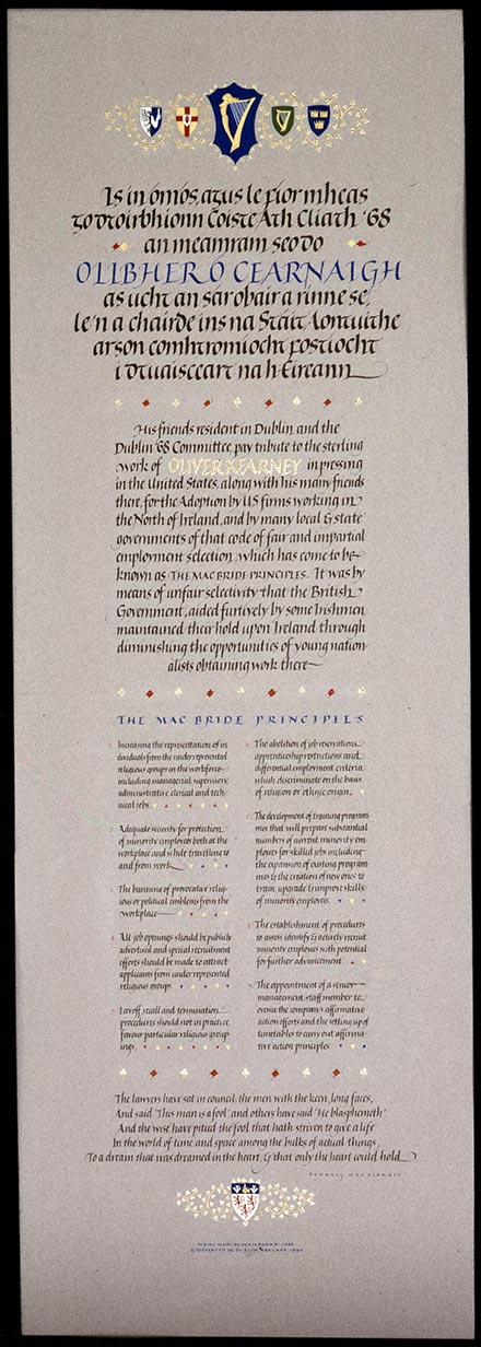
This class is based on the "big project" set as a task for students at the full time calligraphy courses at The Roehampton Institute led by Ann Camp in the 1980s. Thus it may be informative to show some of my own student work done there, as well as some commissions from about this time plus a few later pieces that fit this theme. These images should not limit your choices but may serve as an introduction to some possibilities

.


           Quick thumbnail sketches showing two preliminary ideas
           for a layout. Note that pressure on the pencil has been varied
           to suggest heavier weights of writing for the more important text.


Roughwork for a project

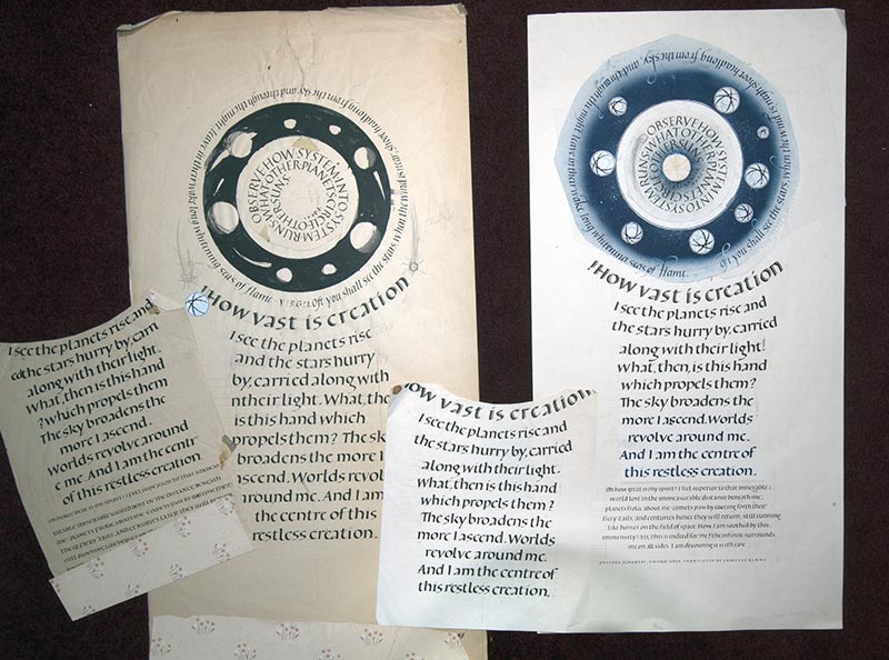
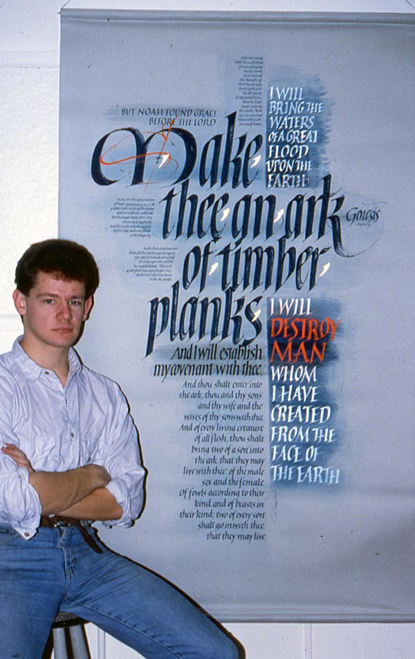
Rough-work above for my own first "big project"made in my first year of study at the Roehampton Institute in London under Ann Camp, 1987. Roughs above left are on the back of some left-over wallpaper and some text blocks were re-done on separate pieces of the same paper to tape over the design in progress. The version at right above is more refined and on better paper though still not the fine paper used in the final piece which is shown below. Not a masterpiece by any means but it was a good challenge for me aged 17! A lot more rough-work was done than shown here.


final project   Main text in foundational hand with purple italic at the top circling the illustration with Roman capitals at the centre. The main text begins curving and gradually straightens. Towards its bottom, the colour graduates from black back to the blue of the first line. A line of compressed foundational hand below is lighter in weight and its colour graduates from black to the same purple as the italic at top. The blue colour of the illustration was mixed to match the blue Ingres paper that I used to cover the mount. At the very base, a line of accreditation is presented in lightweight capitals, spaced extra wide and repeating the blue colour once again.
 
Grant of Arms   Official Grant of Arms from the Genealogical office of Ireland. Gouache and gilding on calfskin vellum. Denis Brown 1989. Enlarge in a new window
A symmetrical arrangement where the main central text is in Irish language and two flanking columns of smaller and lighter italic provide an English translation. The motto from the coat of arms is written around all as a border of alternating blue and gold capitals.
 
Heraldic Panel  

Third year student piece by Denis Brown 1987. An asymmetric composition where text blocks at left are ranged right so as to align neatly against the right hand columns, with an even division of white space between them.

To facilitate making a flush right hand margin, or indeed a centred text block, cut and paste lines of a trial into the desired arrangement and use this paste-up to measure the start and end points of each line on your next trial. Try folding the paste-up to position each line of text just above the same line as you write the new version. This way you can see at a glance if all is going down correctly.

     
Formal Address  

Illuminated Address, Denis Brown 1989.
Stick ink, gouache, shell gold and raised and burnished gilding on a gray Canson paper.

Centered  text blocks at top and bottom with justified blocks in between. (Justification means both margins have a straight, non-ragged edge.) The composition swells at top like a Corinthian capital atop a stone column and at the base features a similar if more subtle swelling.


Limited edition print


"Digital, pertaining to the fingers", limited edition print, Denis Brown 2001
An asymmetric layout with a clear hierarchy of importance, denoted by size and weight of calligraphy in each part of the composition.


Limited edition print


"Essence" Artist’s print on hand-painted paper by Denis Brown, 2014
A centered text with an enlarged bold first line balanced against a lightweight second line of red capitals. The composition here was done digitally but similar layering can be done by hand if the tone of the colours is carefully controlled.


Pangur Ban   A more informal presentation where the main text, the first verse of the poem, was written on curved guidelines  which were drawn freehand between measured points. Four more verses are  written very small, to frame the piece in an ellipse. Illustrations sit better on the strong vellum-grain background thanks to the faint tones of coloured writing behind them.

Make thee an Ark


  Some quality papers can be bought in a large roll if you really want to work big! This is yours truly with a work made in my third and final year of study at Roehampton in 1989. It's on Canson Mi-Tientes paper from a roll, and I colour-washed it after stretching the paper down to the large workbench surface, which ensured it would not cockle with the wet wash. Note the hierarchical structure of size and weight of text blocks and how several are aligned flush right against flush left.
smaller project


If you wish to work on smaller projects in addition or instead of a large complex piece, this is also an option. My 2014 piece above makes an effective contrast of weigh and scale between the larger Irish text and its interlinear translation. The normal hierarchy that capitals are more important than lower case is subverted here due to the caps being much smaller, so they maintain effective balance. The flourishes with the tiny fish drawings envelop the verses without overpowering since they are lighter in weight and in cool colours. The line of accreditation is the lightest weight but its red colour helps it hold just enough presence. To achieve a good balance with effective contrasts takes several trials, even for me now.


Good luck and enjoy the preparation!
If you tend to work fast, consider a bigger project with more complexity.
If your name happens to be Rainer, bring more than one layout!
Make sure you have more than enough material to work on,
you can always work on unfinished projects later at home.
See you in class!


BackHome