Denis Brown Calligraphy Worksheet
A Pointed Italic Alphabet
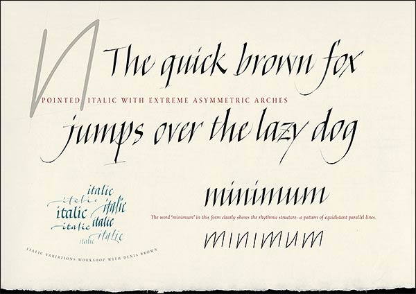
The defining aspects of this form of italic are sharp pointed arches, springing right from the bottom of stems, and with an extreme asymmetric structure, i.e., the highest point of arches at the top of letters, as on "n", is not at the centre but at the top right corner of the letter. The lowest point of bottom arches as on "u" is at the bottom left corner of the letter. Notice that horizontal parts of letters have been given an upward tilt, including crossbars of f and t, and even the top of the angular o and related strokes.
Practice these letters with a broad edged pen held with a nib-angle of about 40 degrees to the horizontal. Advanced calligraphers will notice that there is a lot of pen angle manipulation, (dynamic changes of the angle of the nib within strokes), required to accurately capture the subtleties, but the beginner need not worry about this aspect.
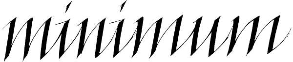
The word “minimum” clearly shows the rhythmic structure- a pattern of equidistant parallel thick lines, with the curved thin upstrokes of arches and ligatures also parallel to each other.
My personal way of writing involves dynamic changes of speed, with quick flicks at the end of many strokes that give an energy and freedom. It's important to try and understand these strokes as dynamic movement, rather than shape, as merely copying the shape will miss the dynamic.
This is a similar though not identical form of italic that I teach in the italic modules of my online educational calligraphy program at Calligraphy.TV. Click the link to visit and watch the free trailer movie.
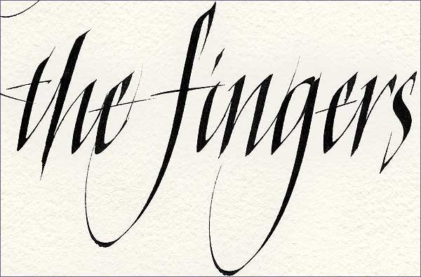
The images above and below show details from a work using this style. Notice that the larger writing above is more compressed than the smaller writing below.

©2020 Denis Brown www.quillskill.com |