Sample Calligraphy Alphabet by Denis Brown
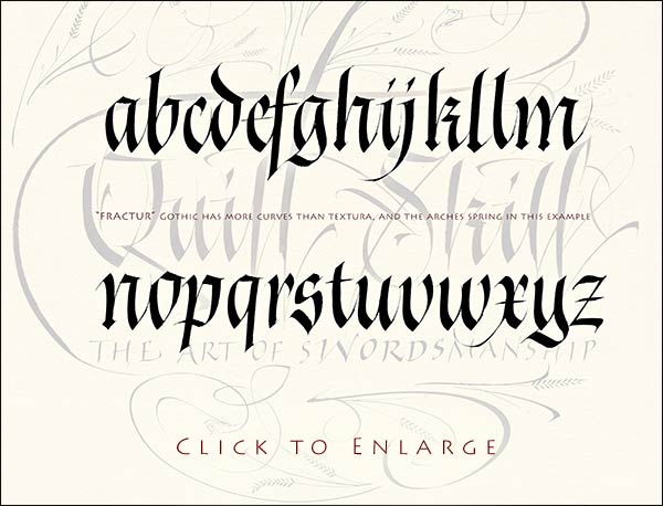
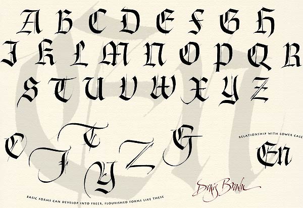
Gothic Alphabet in Fraktur style
Click image above to load a large version in a new window
Novices identify Gothic script as the 'Old English' alphabet, but in fact there are many different Gothic styles, and within any of these, a particular scribe will display his own character. This script is close to the Gothic style known as Fraktur. Practice these letters with a broad edged pen held with a nib-angle of about 40 degrees to the horizontal.
The Fraktur style is characterized by pointed arches, but curved at the sides, giving a less extreme form of Gothic than 'Textura'. Advanced calligraphers will notice that there is a lot of pen angle manipulation in this alphabet, (this means dynamic changes of the angle of the nib within strokes), but the beginner need not worry about this.
My way of writing involves dynamic changes of speed, with quick flicks at the end of many strokes that give an energy and freedom. It's important to try and understand these strokes as dynamic movement, rather than shape, as merely copying the shape will miss the dynamic. Check out the movie link below to understand this point.
©2017 Denis Brown www.quillskill.com |