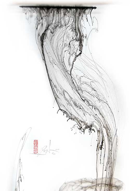
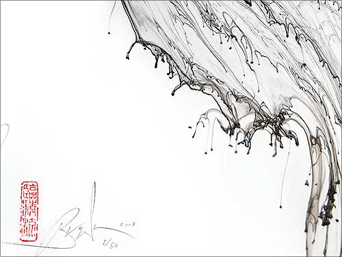
![]() |
I N K F A L L
Ink was dropped into a clear tank of water and allowed to move of its own accord. Natural, beautiful, and requiring no effort. This is an example of what I propose as Reductionist Calligraphy, i.e., calligraphy reduced to the essential. In ancient time, transcription was an essential part of calligraphy, but now we have so many better means to transcribe text... so I let the words go. Let's see if calligraphy can do without. Sometimes I've suggested that rhythmic gestures are the essence of modern calligraphy, but here I managed fine without them. Maybe communication is an essential to all calligraphy? There may still be communication here on various levels; despite no words, no writing, and no expressive gestures of the hand/arm/body. Calligraphy is here reduced to ink alone, flowing beautifully, by itself. Of course, some will say that this is not calligraphy- the word derives from Greek kalli+graphos, meaning beautiful writing. My image is not written, (not by hand at least; but maybe by nature), but my suggestion is that meanings of words change from their etymological origins. The term calligraphy may have emerged from beautifully written words, but the practice has evolved to incorporate abstraction from the word as well as deeper interrogation of what defines 'beautiful' and whether this is always desirable.
See it in real motion: Click Here to watch a movie.
In my work, I have slowly come to accept that, in our time, calligraphy can no longer be seen as a functional pursuit. We have so many more efficient means to communicate text. This leaves me with a sense of sadness, as well as a great artistic freedom. I try to communicate the essence of this dualism in this unwritten calligraphy. I think the falling ink forms a calligraphy that appears to mourn its loss of function, yet simultaneously celebrates its freedom from function.
In a way, I see this work as traditional calligraphy, despite it's unwritten nature. Many people think tradition means following a style, but I believe that practitioners of any tradition need to carry that practice into their own time, and ensure that it remains relevant to the spirit of the age. (In this sense good traditional work is always contemporary to the age it was made. e.g.,The Book of Kells is a masterpiece of its time, but even if a perfect copy of that style were made now, it would be pointless. It is often misunderstood, but traditional and contemporary are not opposites). I see this Reductionist Calligraphy as traditional, in that all the references and underlying concepts are directly related to calligraphy and its history. But it carries these in an age when handwriting itself is becoming all but obsolete, and the term 'functional calligraphy' is an oxymoron. I have a commitment to find deep meaning in my work despite typical marginalization of the field to nostalgic, decorative and sentimental solutions. Denis Brown, Dublin, January 2008
PRODUCTION NOTES Photographed digitally at 10 megapixel resolution, then up-sampled using GF Print Pro to 100 megapixels, prior to image processing and optimization. (Up-sampling to this degree means later processing artifacts are negligible). Processing included optimization of levels, deletion of background artifacts, and selective sharpening or blurring of different areas. It did NOT involve any manipulation of the original composition, nor addition of any computer generated artwork. *NOTE. Images here cannot convey the paper texture. The prints are on 90lb Bockingford watercolor paper, which is just off-white and with a cold-pressed surface (alternatively called NOT pressed), leaving a subtle texture that is very aesthetic.
Price:
US$ 95.00
includes all tax &
airmail costs
for equivalent in other currencies, check the currency calculator at:
www.xe.com/ucc/
|
||||||||||